Secret Garden Poster - my process
I submitted these 3 sketches for the Secret Garden to the client:
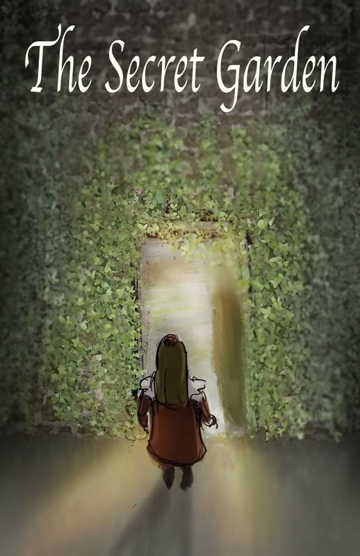
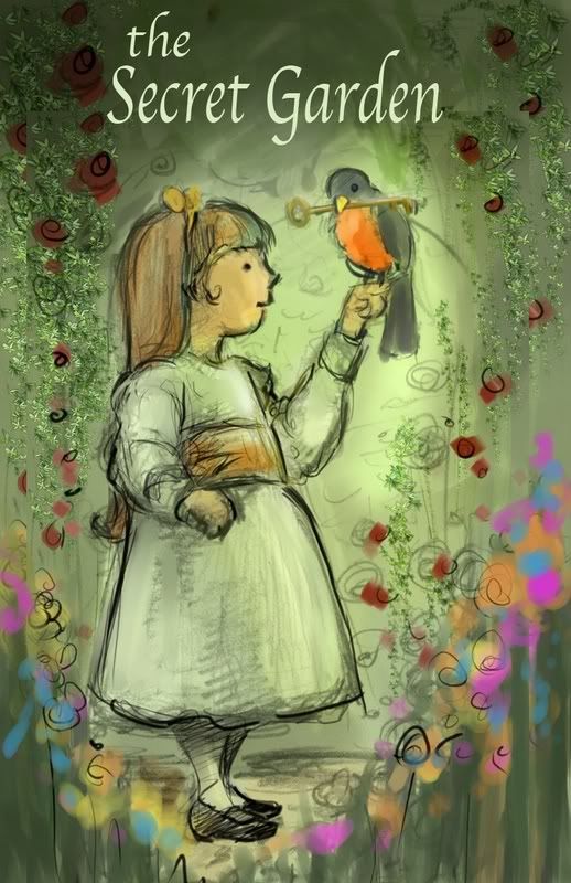
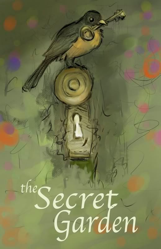
I was lukewarm about the first one as I'd seen several different versions of this same solution for Secret Garden book covers. However, the second two I loved b/c I was told that this particular play was going to stress the magic and the character of the book. They chose the second one which I was excited about. However, I realized that Mary was depicted far too young, so I made a new sketch in my sketchbook for the client that showed a girl of 10 instead of a 4-5 year old"
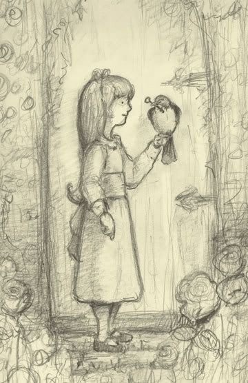
then, I localized my color choices in corel painter as a quick wash underneath the drawing:
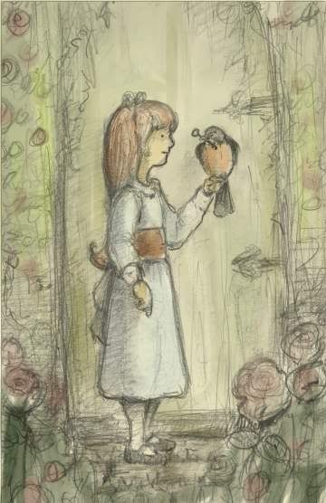
I then approached the rest of the painting with Painter's Vine Charcoal brush, which to me emulates the actual feel of real pastels better than their pastel brush ... I work into just like I would with the real materials, but it gives me much more leeway to correct mistakes, and my hands aren't drying out and chapping like they do with the real materials.
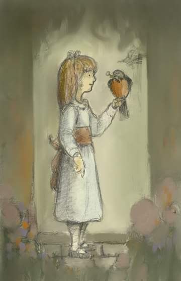
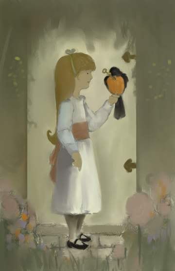
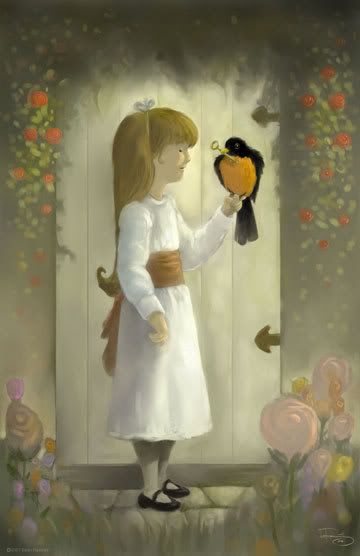
Finally, I came to this image which I was pretty happy with. The detriment to working digitally is that I don't have an actual piece to keep and perhaps sell at a later date, but I did make some high scale prints on nice archival paper to give as a gift. I find that the clients are usually happier when I can make changes on the fly since they are digital images and I can deliver them the files instead of the actual artwork. Professionally, it always works out better, while it is more fun to get your hands dirty with real materials.


I was lukewarm about the first one as I'd seen several different versions of this same solution for Secret Garden book covers. However, the second two I loved b/c I was told that this particular play was going to stress the magic and the character of the book. They chose the second one which I was excited about. However, I realized that Mary was depicted far too young, so I made a new sketch in my sketchbook for the client that showed a girl of 10 instead of a 4-5 year old"

then, I localized my color choices in corel painter as a quick wash underneath the drawing:

I then approached the rest of the painting with Painter's Vine Charcoal brush, which to me emulates the actual feel of real pastels better than their pastel brush ... I work into just like I would with the real materials, but it gives me much more leeway to correct mistakes, and my hands aren't drying out and chapping like they do with the real materials.


Finally, I came to this image which I was pretty happy with. The detriment to working digitally is that I don't have an actual piece to keep and perhaps sell at a later date, but I did make some high scale prints on nice archival paper to give as a gift. I find that the clients are usually happier when I can make changes on the fly since they are digital images and I can deliver them the files instead of the actual artwork. Professionally, it always works out better, while it is more fun to get your hands dirty with real materials.


5 Comments:
ZOOBADOO!
Nice work! I liked the bird and the one you ended up doing equally.
Hope all is well,
r.
i like the final image -
c'mon check out fist-a-cuffs!
Nice colors! I really enjoy the blog.
wut up update
This is great info to know.
Post a Comment
<< Home