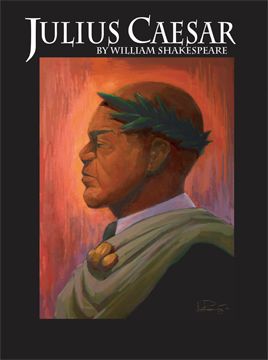
Here's the image with Text attached. I punched up the colors in Photoshop, and did the layout in illustrator. The client usually sticks a bunch of other information on the poster, but I provide them a suggestion of what I would do with the type for the tile and author.
3 Comments:
you listen to your wife?! bah, i pretend i'm deaf.
show the process!
looks good. i'd like to see the final with the info all over it.
feed the blog beast!
I like the pictures. Can I make a teeny suggestion? I'd like them more if the subject was facing the viewer a bit more, maybe on an angle, making a tiny bit of eye contact, just enough to suck me in -- that would make me stop and notice, a connection of sorts.
Otherwise, I like what you've done. I love the bold colors, too.
And no, I'm not an artist, have not one artistic bone in my body (but do know a little bit about marketing).
Keep blogging. I'll be back.
Post a Comment
<< Home